Choosing your background, colors and fonts for a cover
Templates hide the hardest part — choosing. The moment you make your own cover, the choices all come back. Instead of going on feel, use a few rules you can follow.
Ask intent before style
An informational cover, an emotional one, and a promo cover want completely different looks. Informational covers need clarity and dense information; emotional ones need whitespace so one line can breathe; commercial ones need the product and price visible at a glance.
Decide the intent first and every later choice has a reason. Skip it and you'll bounce between colors and fonts forever, because there's no standard to judge against.
Background: solid vs photo
If the text must be read perfectly (tips, tutorials, prices), prefer a solid or low-contrast background — a beautiful photo still fights with text laid over it.
If the cover wins on mood (lifestyle, emotion), a photo background conveys the scene instantly — just darken the text area with a semi-transparent mask for legibility. Poster Cat's cover tools let you drop in a background and auto-dim the text zone for exactly this.
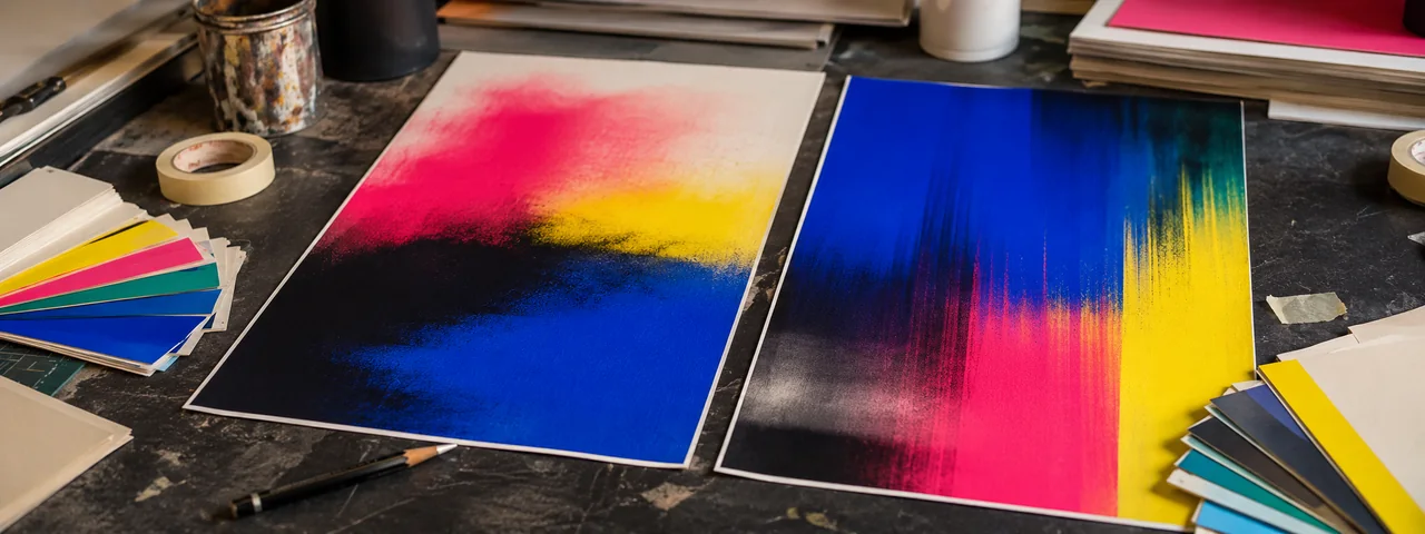
Color: one main + one accent, cap at three
The most common beginner mistake is too many colors. A reliable opener: one main color over the surface, one accent color for the single most important word or button, and let black/white/grey do the rest.
The accent only 'pops' if it contrasts with the main color. Unsure? Build hierarchy from light-and-dark shades of one hue, then add a single saturated contrast color as the accent — it almost never goes wrong.
Fonts: legibility before style
On a phone a cover is often thumbnail-sized. Use sans-serif for body and small text so it survives shrinking; a heavier or more characterful face is fine for the headline, but never let style cost legibility.
Two fonts max per cover: one for the headline, one for the body. More than that and it falls apart. Poster Cat's cover presets already set the type hierarchy for you — type and it's done.
Make it now
Frequently asked questions
How many colors should a cover use?
One main + one accent, plus black/white/grey — three total at most. Put the accent on the most important word, and contrast it with the main color so it pops.
Photo or solid background for a cover?
Depends on whether text must be perfectly legible. For tips/prices/tutorials prefer solid or low-contrast; for mood/lifestyle a photo works, but dim the text area with a semi-transparent mask.
How many fonts can one cover use?
Two at most — one headline, one body. Keep body sans-serif for small screens; a bolder display face is fine for the headline.
Updated · Poster Cat team